There are many articles on constructing a cause-and-effect diagram. But what’s next? How do you prioritize what to focus on first? There are many approaches to this usually termed cause and effect analysis. We’ll focus on four examples ordered from the simplest to the more complex.
Simple Approach to Analyzing Cause and Effect Diagrams: Qualitative Likelihood
In an article titled “Analyzing Cause and Effect Diagrams” from November 2005, SPC for Excel suggests conducting the analysis by answering two questions:
- How likely is a cause to be the cause of the problem [Very (V), Somewhat(S), Not (N)]?
- How easy is it to verify that the cause is the cause of the problem [Very (V), Somewhat (S), Not (N)]?
Work on the causes labeled V V first.
An example cause and effect diagram analysis is provided.
You can access the article here.
Using Multivoting to Prioritize Causes to Work On
In a video from INEXUS. Christian Loyer discusses the Cause and Effect Diagram. How to prioritize the causes to work on begins at 6:25 and ends at 8:49.
He recommends using a concept called multi-voting whereby each team member gets three levels of votes to apply to listed causes: five votes for the most important cause, three votes for cause number 2 in importance, and one vote for cause number 3. At the end of that exercise, you should have the expected two primary causes for effect.
At that point, Christian says to perform the root cause analysis on the primary cause(s) using the Five Whys which will then lead to action plans, ending at 9:46 in the video.
You can watch the video here.
And now for a more complex approach.
A Novel Qualitative and Quantitative Tool for Cause and Effect Analysis: The Drain Pipe Diagram
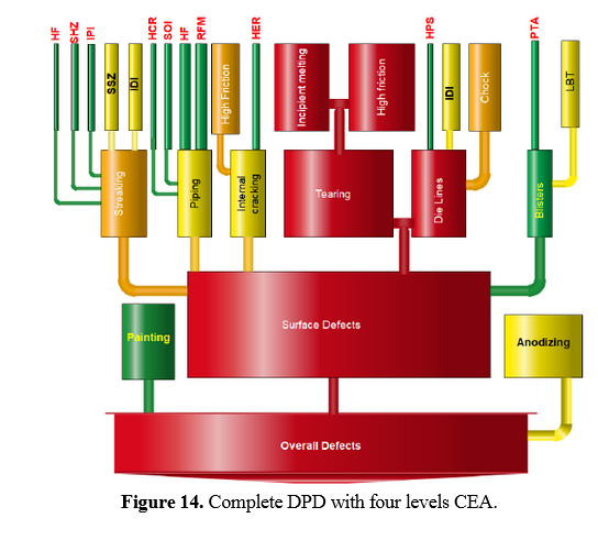
In a paper titled “A Novel Qualitative-Quantitative Cause-and-Effect Tool for Analysis, Presentation and Decision-Support,” author Abdul Kareem Abdul Jawwad presents a novel approach for a qualitative and quantitative tool for cause and effect analysis. Abdul names the approach the Drain Pipe Diagram (DPD)
After a discussion of current cause and effect analysis (CEA) tools, Abdul presents the desired characteristics of a CEA tool:
- Simple and practical
- Useful in handling both qualitative and quantitative analysis
- Capable of supporting decision making
- Capable of dealing with multi-level CEA with ease and without losing its presentation and decision-making support features
- Suitable for both analysis and presentation purposes
- Compatible with other quality tools and policies such as continuous improvement
- Easy to use and interpret
The DPD is applied to a case of surface defects for a metallic extrusion process.
Abdul lists a six-step process for creating a DPD.
The initial completed Drain Pipe Diagram is shown below.
NOTE: As discussed in the article, the colors and the diameter of a “pipe” are assigned based on their contribution or share of the total number of defects.
Read Abdul’s paper here for the details.
And finally, another more complex approach.
Quantifying the Fish Bone Diagram to Determine Which Causes to Work On and Assess Risk
In a paper titled “Investigation of sand inclusion casting defect using a quantitative fishbone diagram,” authors S. M. Ingale and V. A. Raikar discuss the assigning of weights, probabilities, and impacts to the main causes and sub causes in the cause and effect diagram so that associated risks and overall risk can be calculated.
They apply the method to obtain the root cause and associated remedial action for controlling a sand inclusion casting defect.
You can read their paper here.


Leave A Comment