
Use a Yamazumi Chart to highlight the three broad types of process deficiencies to improve in Lean: Muda (Waste), Mura (Unevenness), and Muri (Overburden).
Yamazumi is a Japanese word translated as huge mound, heap, or pile. A Yamazumi chart is simply a stacked bar graph. But by plotting process cycle time by process steps and listing the tasks within a process step as Value Add or Non-value Add, it becomes a powerful tool to not only aid in balancing workload but in highlighting waste. Note: One can also plot cycle time vs. operator or machine.
This short video from BusinessFocus CostDownBoostProfit goes through the steps to use a Yamazumi Chart.
Step 1: Calculate Takt Time
Step 2: List the process steps and cycle time
Step 3: Analyze the process for Value-Add and Non-Value Add tasks
Step4: Conduct a Line Balancing analysis
You can access the video below.
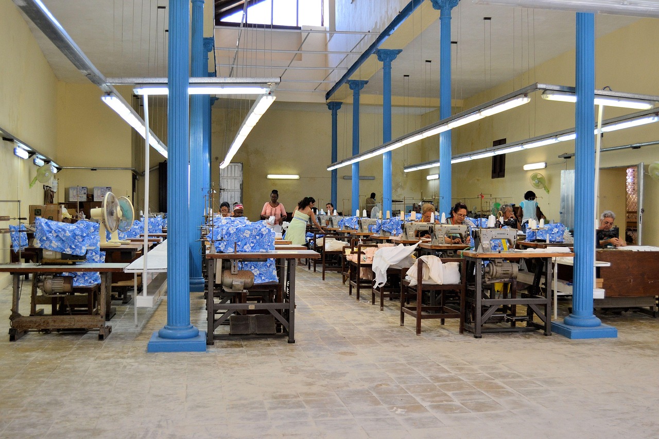
An article from Apparel Resources discusses the use of Yamazumi charts in the garment industry.
The author lists five key advantages of using a Yamazumi chart.
- Visual
- Simple
- Inescapable (As displayed over the production line)
- Public
- Highlights key constraints
Here is a Yamazumi chart from the article for making a casual shirt.
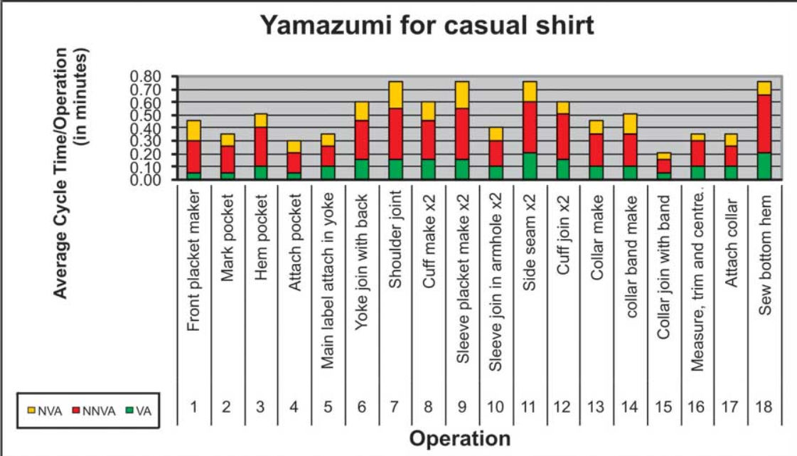
Note: NNVA is Necessary NVA.
You can access the article here.


Leave A Comment