
What assumptions must be met to use a standard control chart? What should you do if one or more are not satisfied?
We will focus on the Individual’s Control Chart.
Three requirements must be met.
- Independence
- Normality
- Subgroup size (n = 1)
Independence
Independence occurs when the position of one data point does not influence the position of the next data point. If that condition is violated, we say the data is autocorrelated.
Let’s check for this in Minitab 17 using the following dataset.
Yt
54.6
55.0
56.1
56.3
60.2
61.6
56.4
55.8
55.0
53.7
54.3
55.9
53.8
48.8
51.7
46.0
49.0
54.2
53.1
53.5
53.2
51.9
51.8
52.0
43.0
45.2
52.1
49.1
53.7
47.7
55.8
54.2
52.7
47.8
43.3
Once the data are loaded, go to Stat > Time Series > Autocorrelation.
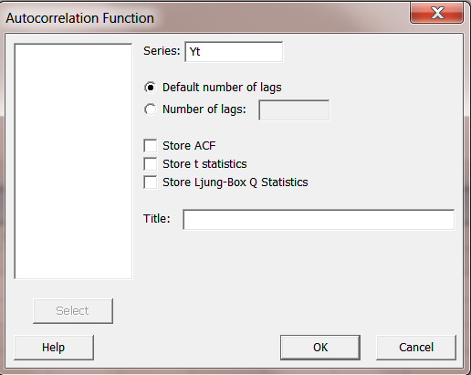
Use the default number of lags.
Click OK to obtain the following graph.
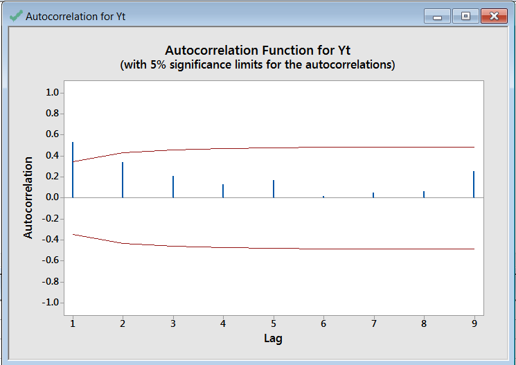
An up arrow beyond the limits indicates the data is positively correlated. A down arrow beyond the limits would signify negative correlation.
Without adjusting for positive autocorrelation, let’s construct an individuals chart for the data.
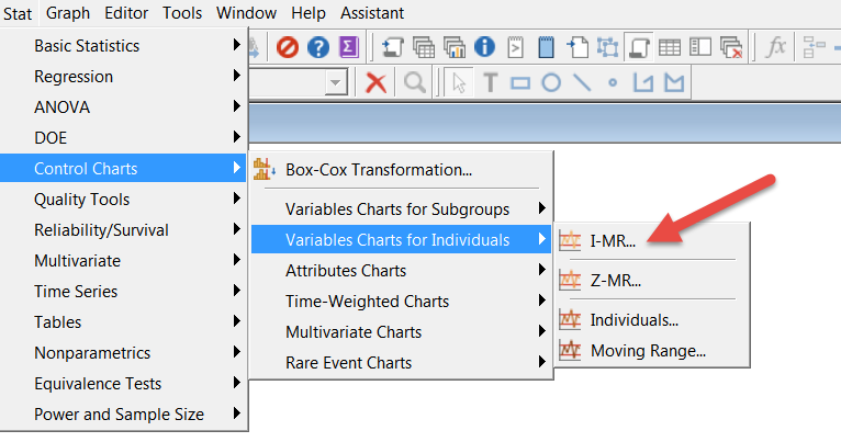
Go to Stat>Control Charts>Variable Charts for Individuals>I-MR
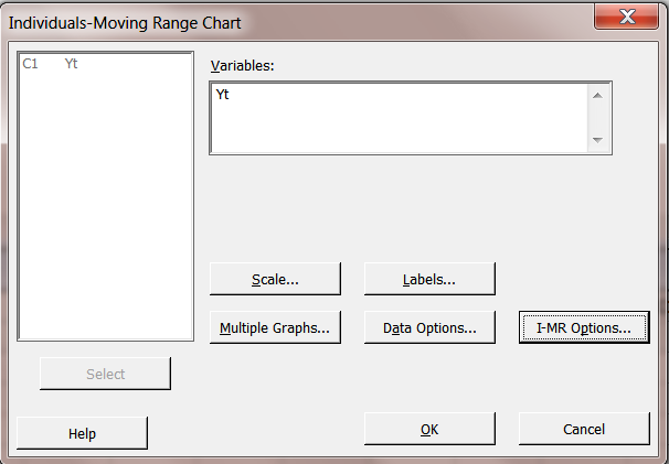
We’ll just click OK without going to I-MR options at this time where we could have chosen the out-of-control tests.
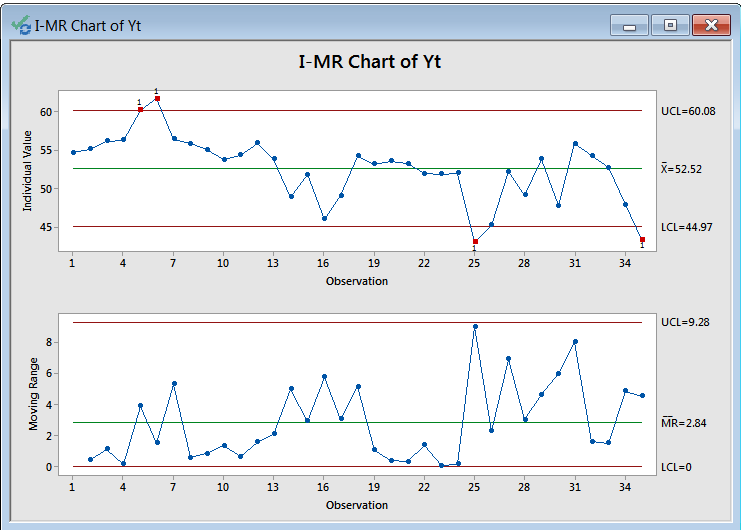
The Individual’s chart has several points out of control. But, let’s see what the I-MR chart pair would look like if we corrected for the significant autocorrelation at lag 1.
Doing this for positively autocorrelated data is usually quite easy. We need to smooth the series using exponential smoothing and save the errors (the difference between the actual and fitted data).
Check the errors for independence and normality. If OK, construct the I-MR chart using the errors.
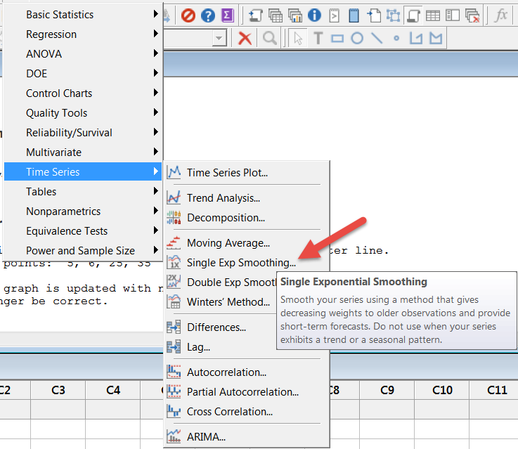
Go to Stat>Time Series>Single Exp Smoothing.
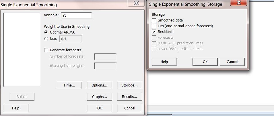
Choose Optimal ARIMA. Choose Storage, Choose Residuals and click OK and OK.
We obtain the following graph.
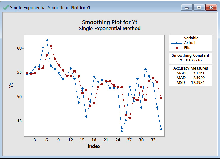
Because you chose Storage, the residuals were added to your worksheet.
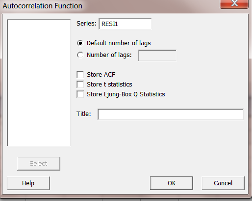
Now let’s check the errors (residuals) to see if they are independent (uncorrelated) and are normally distributed. First, as before, use autocorrelation.
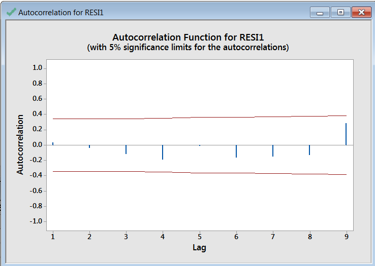
The residuals are uncorrelated. Now let’s check them for normality.
Normality
Plot points follow a normal probability distribution.
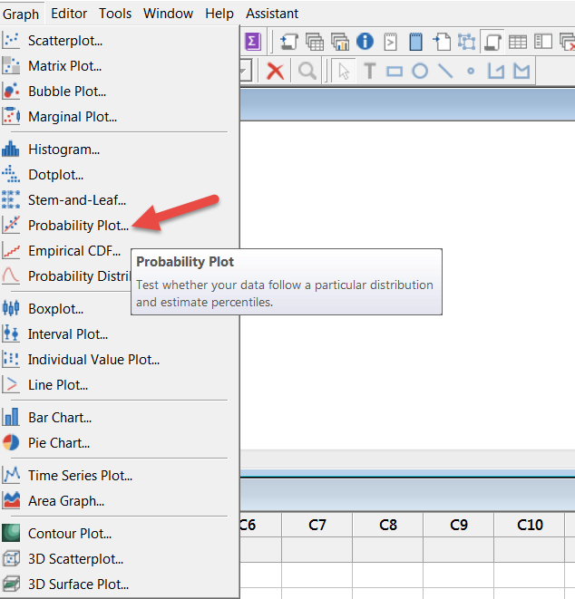
There are several ways to do this. We choose to construct a normal probability plot.
Go to Graph>Probability Plot.
Choose Single and click OK.
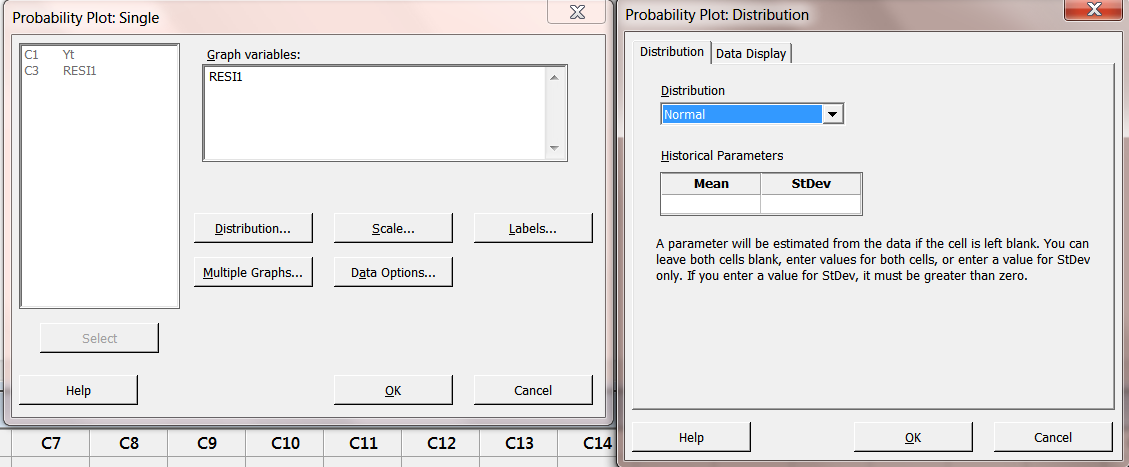
Choose Distribution and Normal. Click OK and OK.
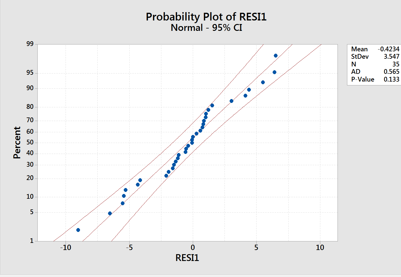
The residuals are normally distributed.
As before, construct an I-MR chart pair using the residuals.
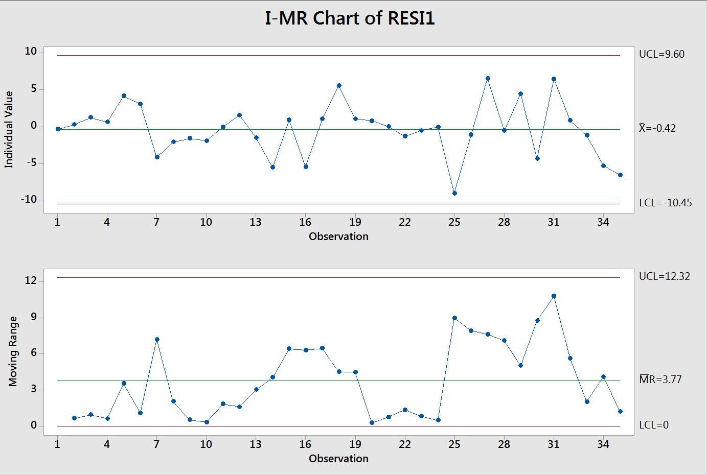
Having adjusted for autocorrelation, we see that the process is in control.
NOTE: What we just did was for a positively autocorrelated series. If the series is negatively autocorrelated, you must conduct a more sophisticated time series analysis using ARIMA. That is beyond the scope of this blog.
However, the topic was addressed in one of ISSSP’s past webinars which is available to members of ISSSP. That webinar, titled SPC for Autocorrelated Data Using Automated Time Series Forecasting was given by John Noguera, Chief Technical Officer and Co-Founder of SigmaXL.
You can see a preview of the webinar here.
Subgroup Size
NOTE: We focused on a series of individual data points, i.e. subgroup size (n) of 1.
If you do have subgroups of size greater than or equal to 2, you will have both within subgroup and between subgroup variation, a case of multiple sources of variation. Standard Shewhart control charts (Xbar-R or S) work when the within subgroup variation is dominant. Otherwise you will get false results. The topic of handling multiple sources of variation in statistical process control is beyond the scope of this blog.


Leave A Comment