
As the foundation for this blog, we refer to two very good videos on Run Charts. While both cover the same material, they are also complementary. So, we recommend you watch both.
In the first video, Michael from the Quality Improvement Division of HSE Ireland covers the Run Chart.
HSE (Health Service Executive) provides all of Ireland’s public health services in hospitals and communities across the country.
The second video is from the University of Toronto Family Medicine – Training Module for Run Charts
This is the material summarized and expanded from both videos:
- A Run Chart displays data over time.
- There are Three Fundamental Elements
- Vertical Axis – Quality Measure
- Horizontal Axis – Time Order
- Center Line – Median
- Why Use a Run Chart?
- How will we know when a process change is an improvement?
- What if there is no change exhibited?
- What if the chart indicates a process deterioration?
- What are the advantages?
- Easy to construct
- How much data is needed?
- You should have at least 10 before interpreting your chart.
- How much data is needed?
- Easy to interpret
- See the 4 rules discussed below.
- Statistical knowledge is not required
- Just use the 4 rules.
- Can be used from the start of a project
- Start plotting as soon as you have your first data point.
- Easy to construct
- How do we interpret a Run Chart?
- 4 Rules for Interpreting a Run Chart
- Rule 1: The Shift
- 6 or more consecutive points all above or below the center line.
- Points on the median do not count.
- 6 or more consecutive points all above or below the center line.
- Rule 2: The Trend
- 5 or more points all going up, or all going down.
- Rule 3: Too Few or Too Many Runs based on the number of data points you have
- Run: One or more consecutive points on the same side of the center line
- Points on the median do not count.
- After counting the number of runs, you need to refer to a table. We provide one below the listing of these rules.
- Run: One or more consecutive points on the same side of the center line
- Rule 4: The Astronomical Data Point
- A single point is easily recognizable as unusually low or high compared to the rest of the data in your chart.
- Rule 1: The Shift
- What does a rule show?
- If a rule is found in the chart, it means a signal has occurred.
- A signal is a pattern in the data that is unlikely to have occurred by chance.
- A signal could represent an improvement following a change, but not necessarily
- Therefore, it is important to include subject matter experts for your process in the interpretation of your run chart.
- If a rule is found in the chart, it means a signal has occurred.
Too Few Runs or Too Many Runs Table:
Table for Checking for Too Many or Too Few Runs on a Run Chart – Table 3.4 from the Health Care Data Guide by Provost and Murray – See reference at end of blog.
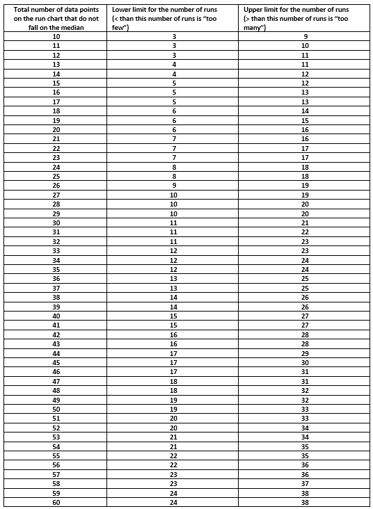
Table is based on about a 5% risk of failing the run test for random patterns of data
Adapted from Swed, Frieda S. and Eisenhart, Churchill. (1943). “Tables for Testing Randomness of Grouping in a Sequence of Alternatives. Annals of Mathematical Statistics. Vol. XIV, pp.66 to 87, Tables II and III.
Valuable Reference:
For more information on using data for improvement with a focus on health care, see
The Health Care Data Guide: Learning from Data for Improvement
Lloyd P. Provost, Sandra K. Murray
Jossey-Bass, 2011
It is the definitive guide to using data to guide improvement, especially using charts, from Run Charts to Shewhart Control Charts and is available on Amazon, Barnes and Noble, and other online booksellers.


Leave A Comment