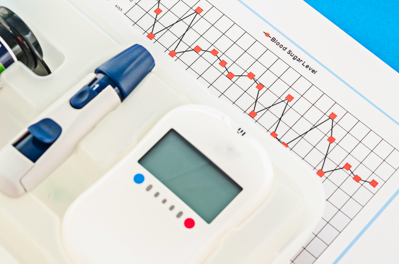
Run Charts are precursors to Shewhart Control Charts, and are extremely valuable for detecting changes, trends, points of improvement, or points of decline.
In this YouTube video from the University of Toronto Family Medicine, targeted for healthcare practitioners, you’ll learn about:
- How run charts are relevant to quality improvement
- Utilizing them to track improvement
- How to design them
Plotting data over time provides a realistic view of process performance.
As the video illustrates, run charts are:
- Easy to construct
- Simple to Interpret
…and do not require complex statistics.
Also, run charts represent important communication tools for making a case for system and process change.
Once the chart is created, analysis and interpretation can begin.
Probability based rules are used to detect changes of a non-random nature.
The four rules detect changes due to:
- Shifts
- Trends
- Too few or too many runs
- Astronomical points
The video gives simple guidelines for determining changes based on the four rules.
Of course, the helpful information provided in the video can be applied to any process whether healthcare related or not.
You can view the video here:


Leave A Comment